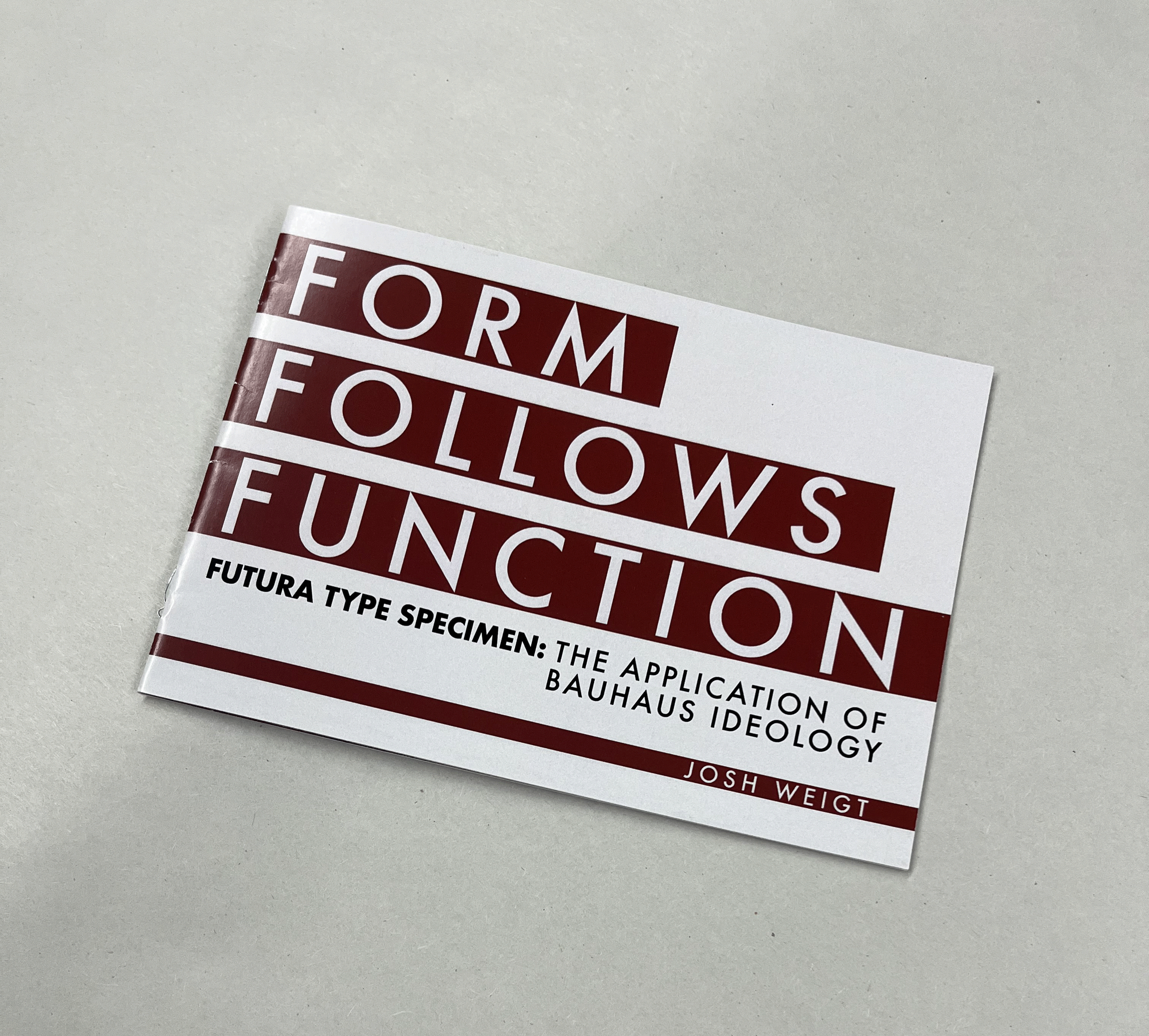
FUTURA TYPE SPECIMEN BOOKLET
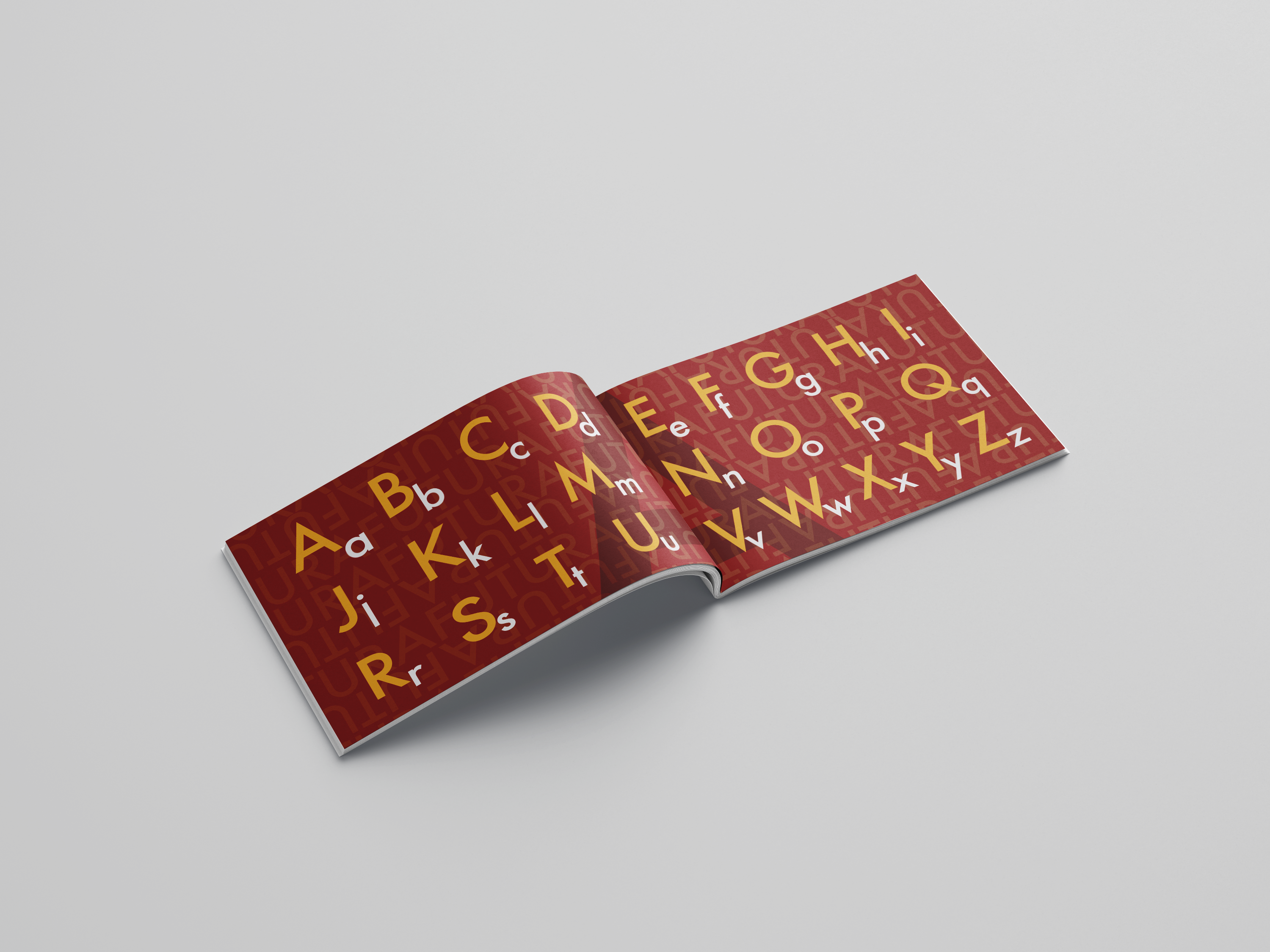
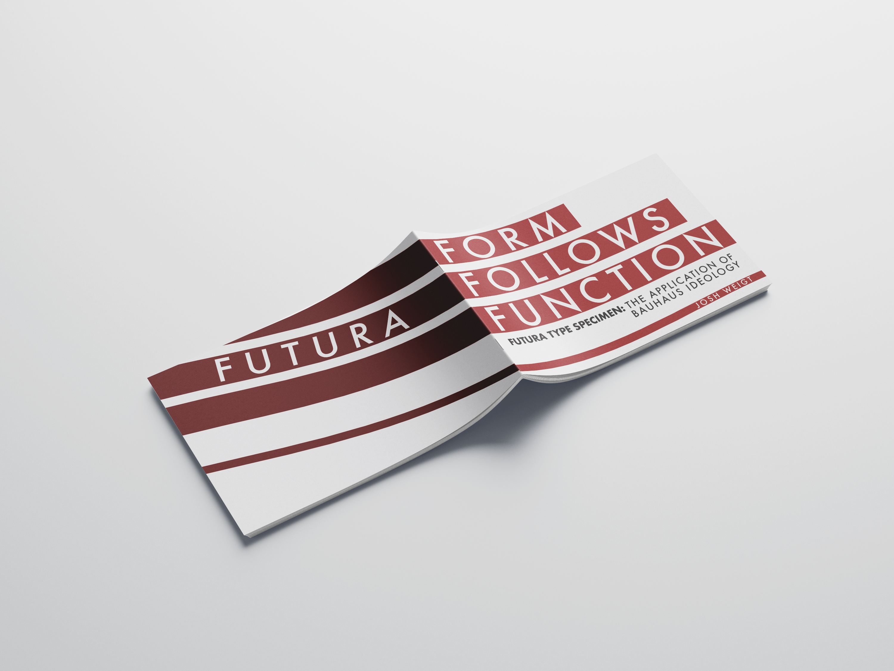
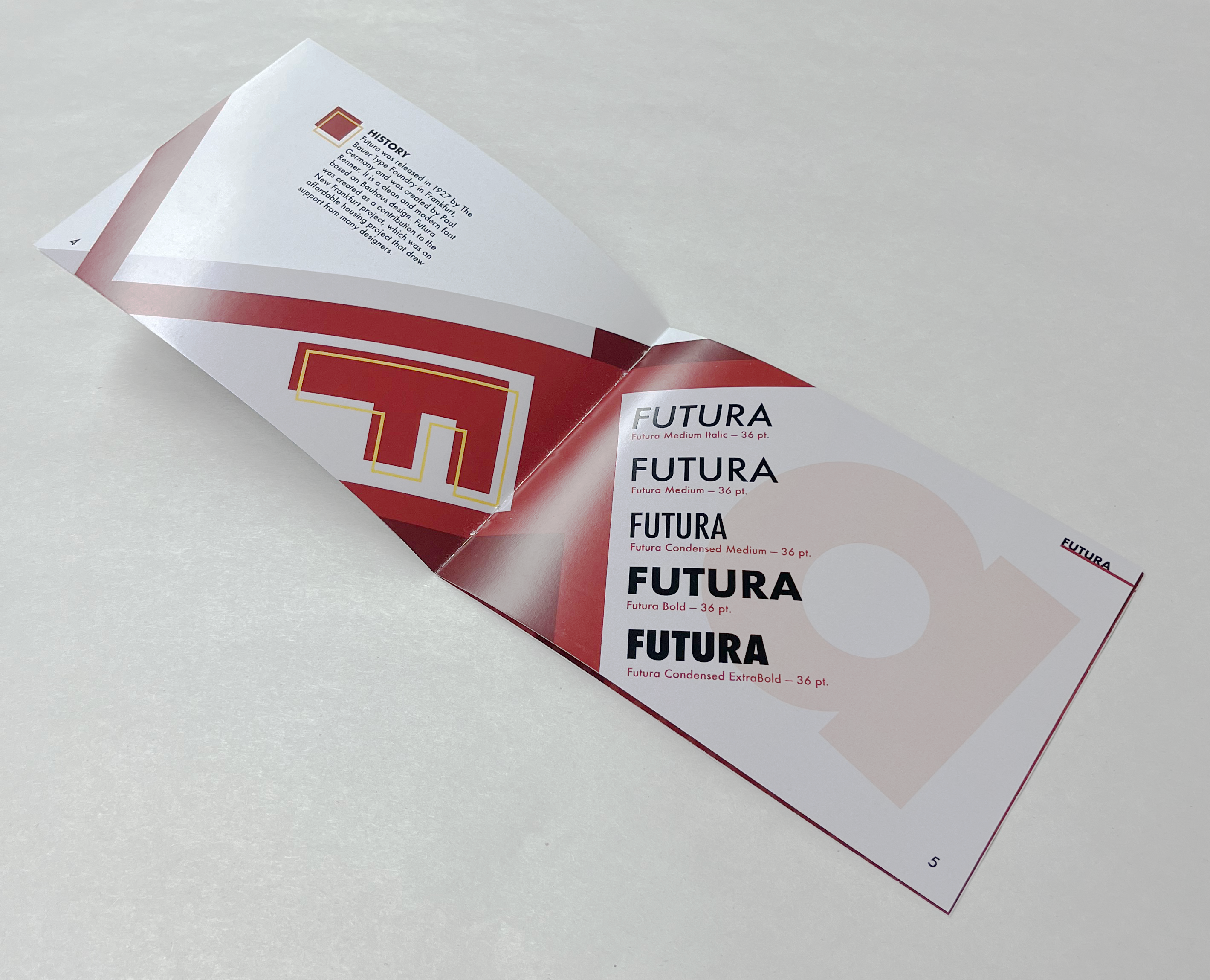
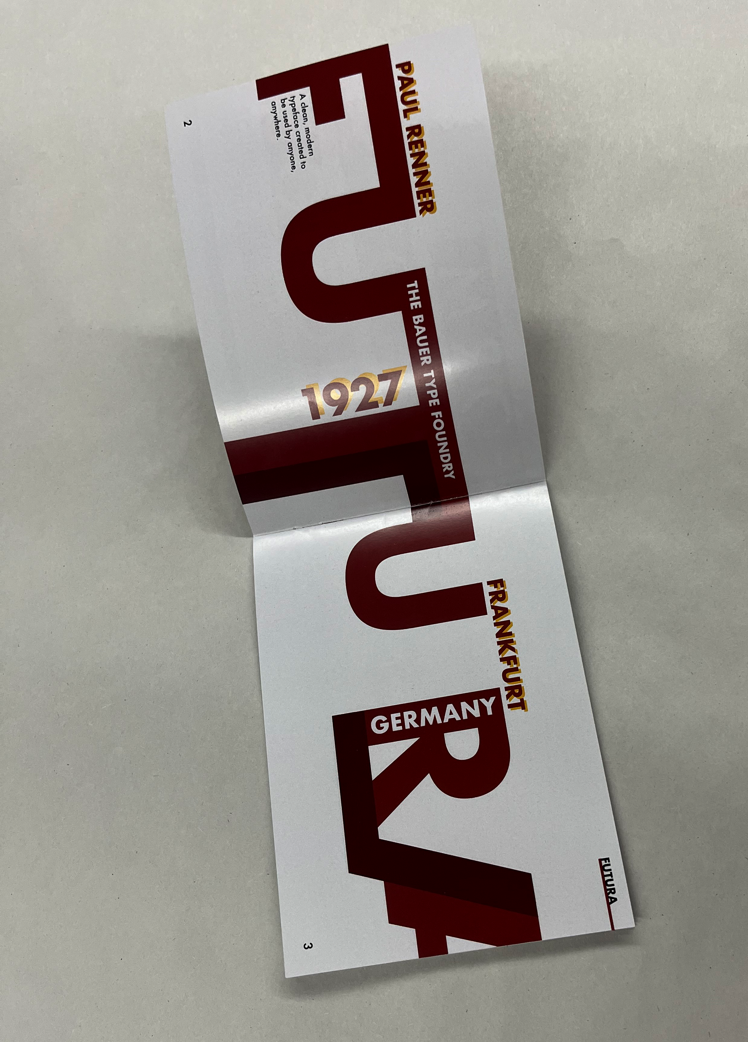
For this project, I created a type specimen book showcasing the typeface Futura. I chose Futura for its distinctive characteristics and its alignment with the clean, modern design style I enjoy. The book covers everything from Futura's fonts, sizes, and applications to its history and design context.
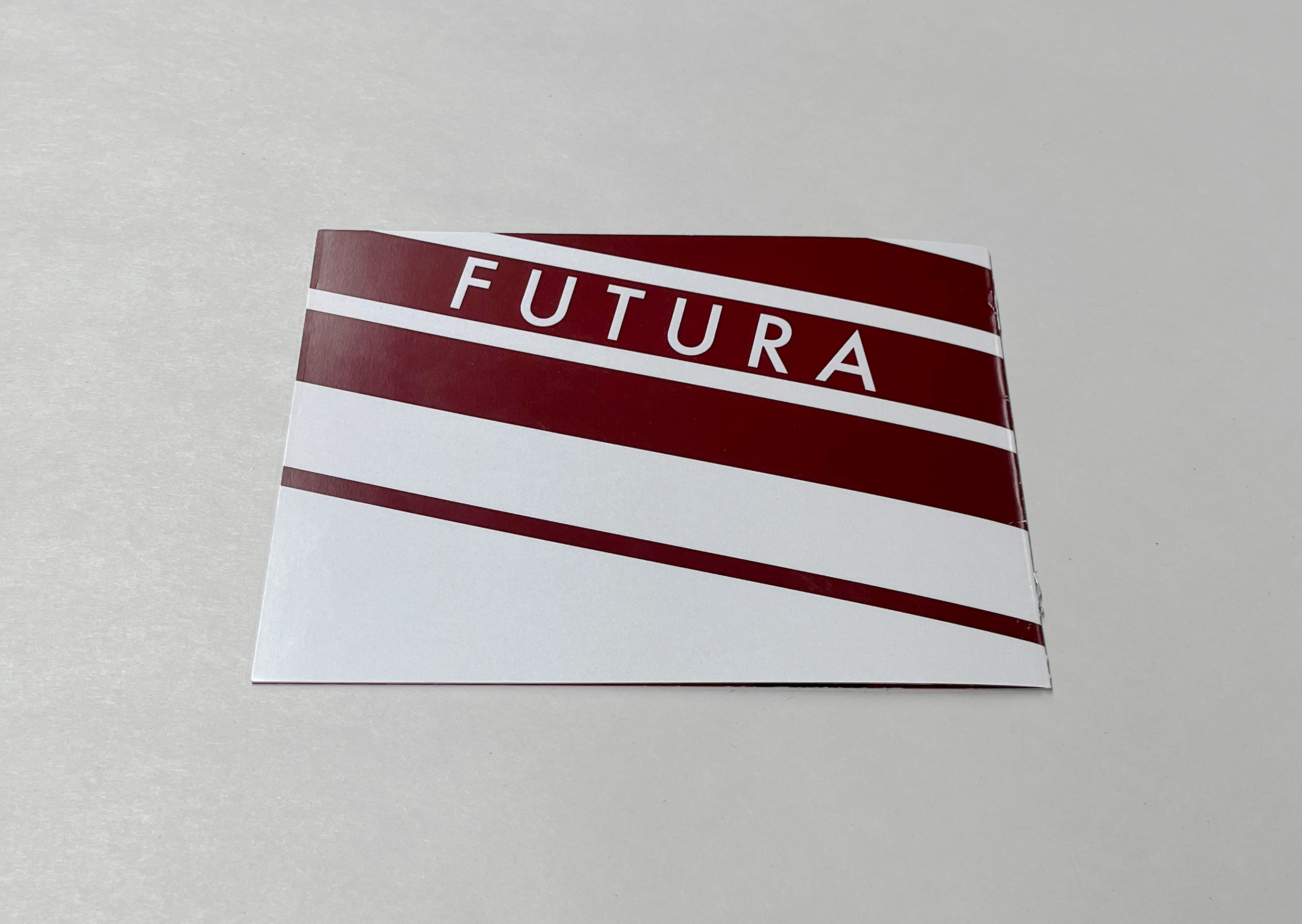
To reflect its modern, geometric qualities, I incorporated bold geometric shapes throughout the layouts. I selected red as the primary color for its strength and impact—qualities that, to me, mirror Futura's personality.
This project strengthened my skills in two-page spread layout design, consistency across multiple pages, and the effective use of color and hierarchy to communicate clearly. It also deepened my understanding of how visual choices can affect how themes such as typefaces are perceived.